[Please note that this article was originally written in German in 2016; all screenshots are in German but you will understand them nevertheless. The text has been translated automatically so please excuse the English]
In September 2015, I stood on a big Google stage in Berlin and showed the advantages of the new features of Google Trends in addition to a demo of voice search. For a data lover like me, Google Trends is a fascinating tool if you understand all the pitfalls and know how to avoid them. At the same time the tool offers a lot of potential for misunderstandings Search queries are placed in <> brackets.
- Misunderstanding: Not all search queries are considered.
- Misunderstanding: The lines say nothing about the search volume / No absolute numbers.
- Misunderstanding: Google trends search queries are different
- Misunderstanding: Rising lines no longer mean search queries.
- Misunderstanding: Without a benchmark, Google Trends is worthless.
1st Misunderstanding: The basis of Google Trends Data
Google Trends is not based on all the searches you enter on Google. Quote: “The Google Trends data is a random selection of data from Google searches. Only a certain percentage of the searches are used to determine the trend data. […] Trends only analyzes data for popular keywords. Low-volume search terms therefore appear as 0. […] Trends removes repeated searches from the same person within a short period of time.” There is no definition of when a term is popular or what a short period is. It is not said whether the random selection is a representative sample of the total population of all search queries (the term “random” suggests this). The first finding is that we are talking about trends, no more and no less.
2nd Misunderstanding: Graphs and search volumes in Google Trends
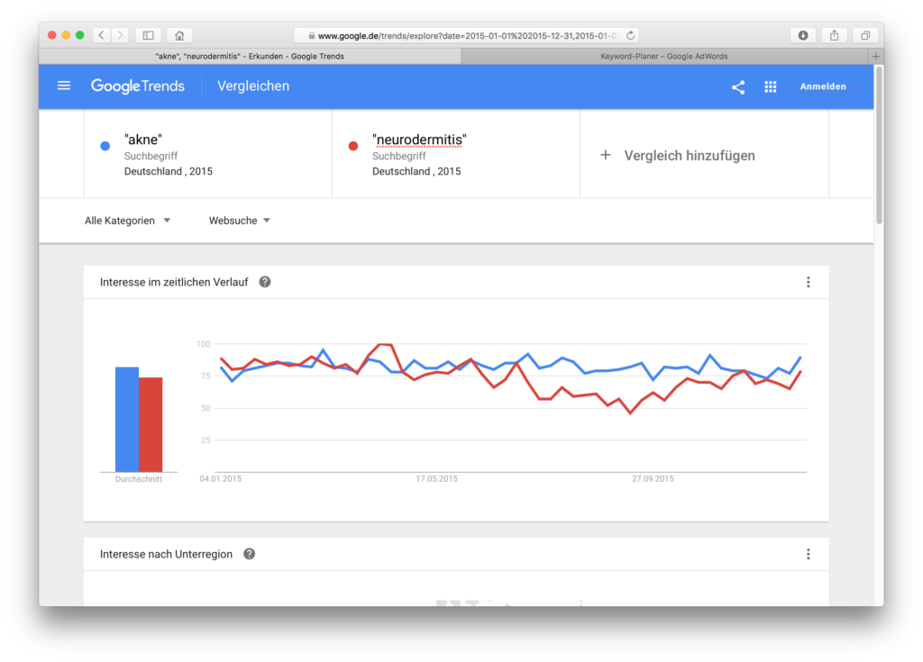
This is the biggest and most fatal misunderstanding. If one curve is above the other, it does not mean that one term was searched for more often than the other. Whaaaaat? Really? Yes. Fancy an example? We are looking for acne and neurodermatitis (I’ll explain below why I write this in quotation marks in the mask) for Germany in 2015. Acne and neurodermatitis alternate in search interest, but acne seems to have a higher search interest more often:
And then I take a look at the data in the Google AdWords Keyword Planner, for the same period, for the same country:

What is interesting here is not the graphic (I only made the screenshot to show that I am searching in the same country for the same period), but the two lines below, where we see the average search volume per month. Neurodermatitis is far above acne, 74,000 to 18,100.
Average values can lead us in the wrong direction, so we also look at the data plotted for each month:

We see a similarity to the Google Trends graphic, namely that the searches for neurodermatitis go down from May or the middle of the year and up again from September. And, this will become important later on, neurodermatitis will reach 100 on Google Trends, but acne never reaches this point. Otherwise the curves of the AdWords data do not touch each other once like in Google Trends. They are far apart. The second finding is that we can’t use Google Trends data to claim that one term is searched for more often than another (although Google Trends is often misused for this purpose). Google Trends does not provide absolute figures. Sorry. But why not? Let’s move on to the next misunderstanding.
3. Misunderstanding: What is a search query?
If you enter in Google or in the Google AdWords Keyword Planner, you will only search for this term. If you enter in Google Trends, you will automatically search for other terms, even if you have not selected a topic, but only this search term (see the help section of Google Trends). So you can restrict something by putting a term in quotation marks (“acne creme”), but this only restricts that is not searched for, but could be included. Which search terms are included, is not disclosed. An “exact match” does not exist, see the help section again.
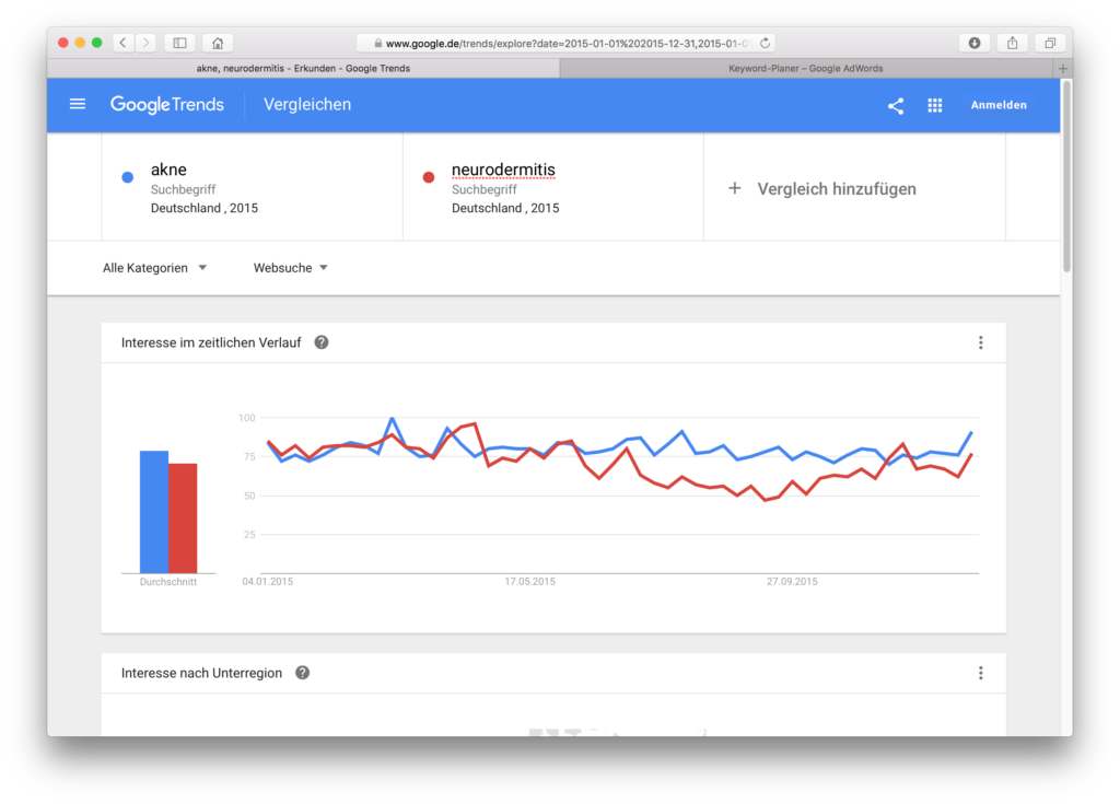
In this example, we compare the search terms and . If we add quotation marks, the curves look a bit different:
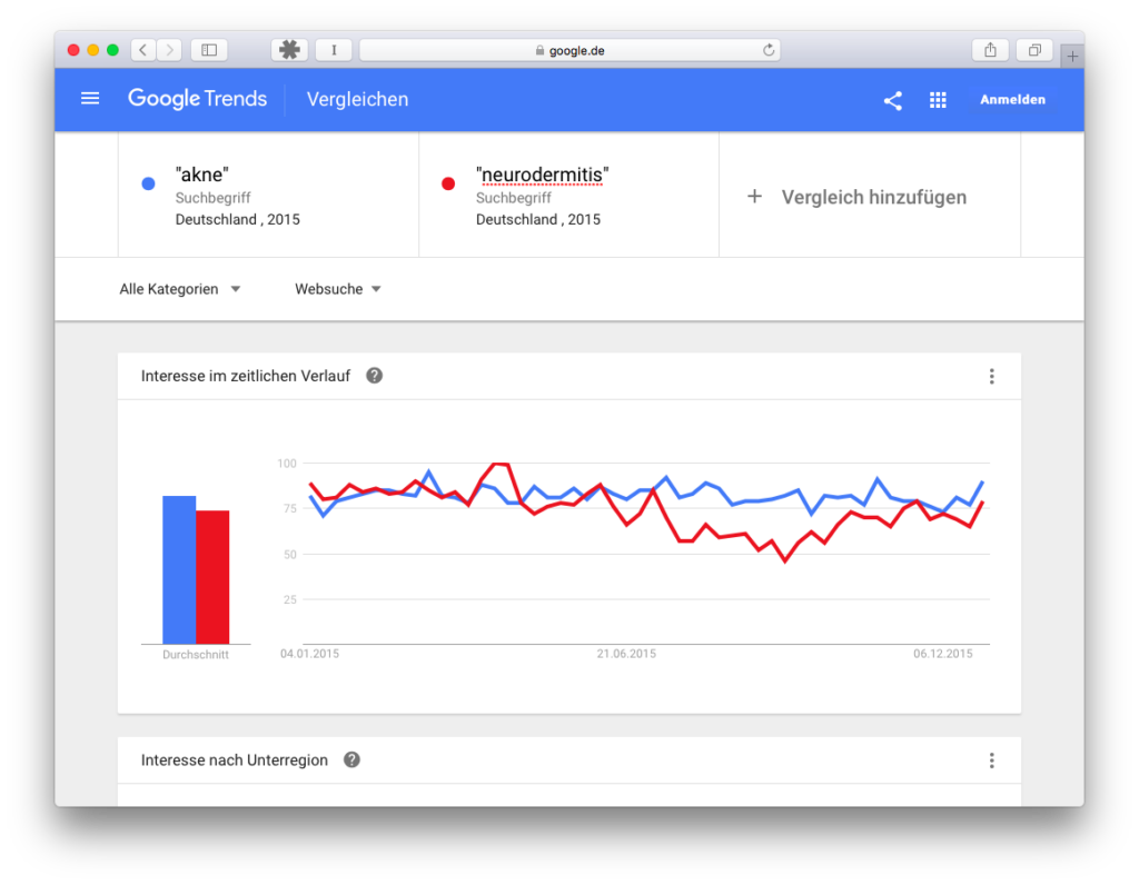
Not a huge change, but there’s a difference we’ll remember for later: If we enter the terms without quotation marks, then comes close to 100, with quotation marks comes close to 100.
It is astonishing, because with a one-word term, where no synonyms are searched for, there can be no different order for the words in the search query. I can’t explain this phenomenon.
Finally, let’s look at what happens when we select the automatically identified topic “disease” (Note: Google turns automatically , which is the medical term for neurodermatitis):

Here, the trend data of terms that fit into the group of the disease are aggregated. The “search interest” in neurodermatitis approaches the topic of acne in February 2016, but acne as a topic seems to have a greater search interest than neurodermatitis. Again, we do not know which terms are grouped together. So it could be that the different data comes from the fact that Google Trends includes additional terms for both terms, but for the term acne terms whose search interest is different and therefore changes the result. However, this does not sound very plausible. Third finding: Google trend data is not comparable with AdWords data, because the input is interpreted and enriched differently and we at Google Trends do not know with what.
However, the differences between AdWords and trends are probably still not explained. What could be other reasons?
4th Misunderstanding: Everything that rises or falls is a trend in Google Trends
Now it’s getting a little mathematical. Google Trends does not offer absolute numbers, all data is displayed on a scale from 0 to 100. And now we remember the two clues above again when one of the two query curves touched 100. Touching the 100 has great significance, because from this highest point of search interest, everything else is calculated!
But it becomes even more complicated: First of all, the search interest is the search volume for a term divided by the search volume of all terms. Since we do not know the base (i.e. how many searches there were in total on that day) and this base changes every day, it is possible that the line of search interest for a term changes, although this term is searched for equally often every day. The point in time at which the maximum of this ratio search term/all search terms is reached becomes the maximum, i.e. 100 in the Google Trends diagram, and all other values, including those of comparison terms, are derived normalized from it. And only for the selected period. If this is changed, the maximum will also be recalculated. This leads to differences that could tempt you to choose exactly the period that matches what you would like to sell Examples:

Misinterpretation: Compared to the weather, interest in Trump has hardly increased in the last 12 months

Misinterpretation: In the last 30 days interest in Trump has not increased as much as interest in weather. In fact, the data from Google Trends are not yet updated, the election day and the previous day are missing.
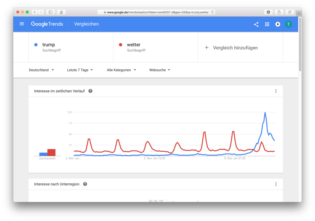
The diagram for the last 7 days: Can we now say that Trump was searched for more often than the weather?
These last graphics are very nice because they clearly show that the Germans didn’t necessarily search less for the weather, but the search queries for the term Trump on 9.11 had a much higher share in the population of all searches compared to the 6 days before. From this one maximum everything else is calculated. But over 30 days the weather had a maximum (EDIT: Because the day after the election was not yet there and it is also two days later not! Thanks to Jean-Luc for this hint!), and then it will be calculated from there. That’s why these dates can differ so much.
Edit: If you look one day after the election and only look at the last day (i.e. data that is about 10 minutes old), then the result looks like this:

Again the weather is higher, although Trump gets close. Is it? Well, I took this screenshot in the evening, and the peak of Trump searches probably took place more than 24 hours ago. It is very likely that I would have got another image if I had made the same query this morning.
What do we take out of this misunderstanding? 1. the period of observation is immensely important, and you shouldn’t believe a trend graphic without looking at several periods of time 2. all observations start from the maximum and are then relatively visible from this maximum, but are at the same time dependent on the total volume of all search queries, which we do not know. 3. it may not be so obvious in the graphs, but in the 7-day graph it is calculated on an hourly basis, in the 30-day graph on a daily basis, in the 12-month graph on a weekly basis. The Google AdWords Keyword Planner delivers data on a monthly basis. This is another reason why the data is not comparable.
EDIT: 4th Learning: “The last 30 days” does not necessarily mean that the last 30 days are really in
5th Misunderstanding: Everything that rises or falls is a trend in Google Trends, Part 2
Depends on how you define trend. After the Brexit vote, a journalist found out through Google Trends that the British had googled only after the vote, what the Brexit means, many newspapers wrote about it, and only after a data analyst had looked at what was really happening, did everyone row back. Yes, there was more searching based on… see the 4th misunderstanding But compared to a popular search query, there was only a twitch. Data must always be put into context to get a feel for what it really means. Although I’m not a football fan, I like to use the search query , but also to see how relevant a term really is.
The weather is always searched for, but a certain seasonality can also be observed here, Bundesliga is primarily searched for by a part of the population, and that only seasonally, but interesting observations can also be made here.
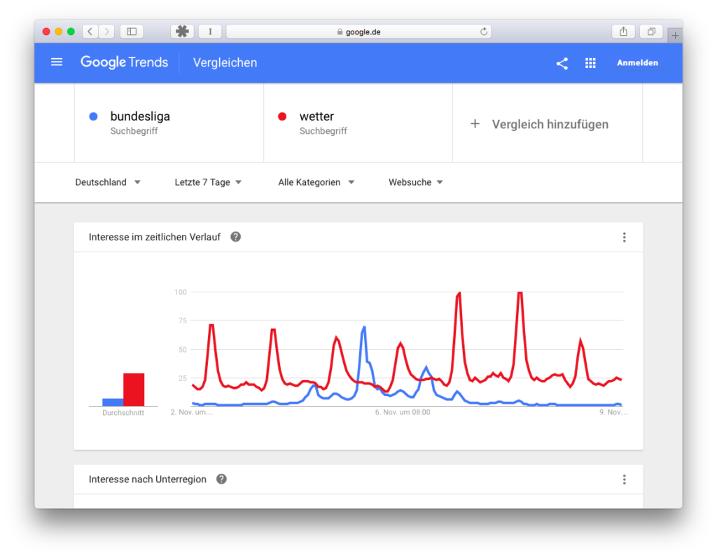
We see the Friday game (first small dent in the blue curve), the Saturday games (biggest dent in the blue curve) and then again smaller dents for the Sunday games. The weather here has the highest swings, especially on Monday and Tuesday (maybe because of the snow?). So were you looking for the weather more often? No, not necessarily! Since here everything is calculated on an hourly basis, everything is calculated from the maximum on 8.11., 5 and 6 o’clock, at this time the search interest (search query/all search queries) was highest, and everything else is calculated relatively. So it can be theoretical that on Saturday afternoon you searched more often for Bundesliga than for weather on 8.11., but the total population of search queries was higher! What do we take with us? We always need a reference point, a benchmark, something with which we can compare the search interest. And best of all, we also know something about this reference point, as in this case, for example, that it snowed, and that’s why there were outliers.
Summary
The mechanism “I enter two terms into Google Trends and see which one is more popular” simply doesn’t work. This will be hard to get out of your heads, because the interface is wonderfully intuitive and literally leads to this interpretation, and it’s not completely wrong either. It’s difficult if you want to make momentous decisions based on this data, additional data is necessary. Keyword planner data are no longer available to everyone, but are not directly comparable anyway, since Google trend data do not compare pure terms.
And yet Google Trends is more than just a gimmick. You only have to invest a little more brain fat in all of the above to build a real story out of it.
Sorry for the lurid title, by the way. I wanted your attention. I hope it was worth it